The Psychology of Tan in Design
Choosing a tan color palette in design is more than just an aesthetic choice. The hue evokes certain emotions and connotations that can influence the perception of a space. Tan tones, often associated with the natural elements of sand, wood, or leather, can offer a sense of calm and stability. They provide a neutral backdrop that can be soothing and unobtrusive.
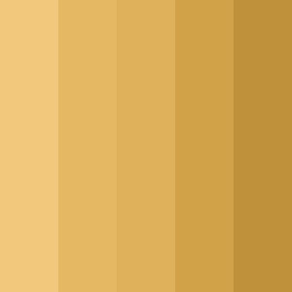
Establishing a Base: Selecting the Perfect Tan Shade
Choosing the right tan shade lays the foundation for your color palette. The perfect tan should serve as a versatile base that complements various design elements. To select the best tan for your project, consider the following steps:
- Assess the Natural Light: Observe how natural light interacts with the space throughout the day. Light can dramatically alter the appearance of tan, making it critical to test samples in various lighting conditions.
- Understand Undertones: Tan can have yellow, red, or green undertones. Select a tan with undertones that enhance the room’s mood and complement its existing features. For instance, a tan with warm undertones can create a cozy feel, while a cooler undertone can provide a more modern touch.
- Experiment with Shades: Don’t settle on the first tan you find. Try out multiple shades to see which one naturally fits the space and aligns with your design intentions. Remember to view them next to other colors and materials you plan to use.
- Consider the Context: The shade of tan should align with the overall design concept. Whether it’s a minimalist look or a rustic style, ensure the tan supports the aesthetic you’re aiming for.
Complementary Colors for a Tan Palette
When crafting a chic tan color palette, selecting complementary colors is crucial for achieving a cohesive look. These colors, when paired with tan, can either create a subtle, harmonious theme or a striking contrast that energizes the space.
- Bright and Bold: For a vibrant and dynamic look, consider adding pops of bright colors like teal, coral, or mustard. These hues stand out against the neutrality of tan, drawing the eye and injecting personality.
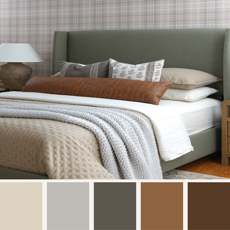
- Soft Neutrals: If a soft, understated aesthetic is your goal, pair tan with off-whites, soft grays, or muted beiges. This palette will promote tranquility and a seamless flow throughout the space.
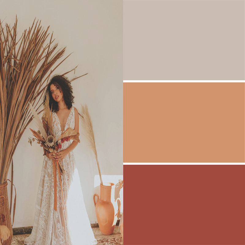
- Rich and Earthy: Enhance the natural qualities of tan by incorporating rich earth tones such as forest green, deep burgundy, or burnt orange. These colors echo the warmth of tan and contribute to a cozy, inviting ambiance.
- Cool Blues and Greens: To cool down the warmth of tan, integrate shades of blue and green. Dusty blues and sage greens balance the warmth of tan, offering a fresh and modern take.
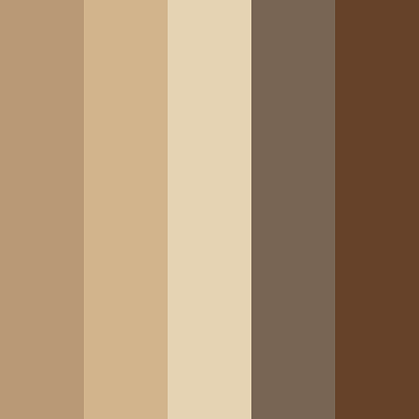
Textures and Materials that Accentuate Tan Hues
To enrich a tan color palette, it is key to choose textures and materials that enhance its warmth and versatility. These elements can add depth and character to a space, making the tan tones come alive.
- Natural Wood: Woods with a natural finish bring out the organic qualities of tan. They ground the space with solidity and warmth.
- Soft Fabrics: Materials like linen, cotton, or velvet in tan can soften a room. They invite touch and add comfort.
- Stone Surfaces: Using marble, granite, or sandstone adds a cool, textured contrast to tan’s warmth. Stone surfaces bring in a timeless elegance.
- Metal Accents: Metals like brass, copper, or gold highlight tan hues with a touch of luxury. They reflect light and create a chic look.
- Woven Baskets: Incorporating baskets adds an artisanal element. They offer practical storage while enhancing the tan theme.
Lighting and Its Impact on Tan Colors
Lighting plays a critical role in how we perceive tan shades in design. Different lighting conditions can change the way tan looks and feels in a space. Here are some key points to consider:
- Natural vs. Artificial Light: Natural light can bring out the true color of tan, while artificial light may alter its appearance. For instance, warm artificial light can enhance the coziness of tan, whereas cooler light might make it appear more muted.
- Time of Day: The angle and intensity of sunlight change throughout the day. Morning light tends to be softer, giving tan a gentle warmth. The midday sun can intensify the color, while evening light adds a golden glow.
- Light Direction: The direction of light also matters. Light coming from the north is usually cooler, which can make tan look sharper. Southern light is warmer and can make tan appear richer.
- Bulb Temperature: The color temperature of bulbs ranges from warm to cool. Choose a bulb that complements the tan shade you’ve selected. Warm bulbs work well with cozy, inviting spaces; cool bulbs are better for a crisp, modern look.
Incorporating Tan in Different Design Styles
A tan color palette can seamlessly integrate into various design styles, reflecting versatility and adaptability in decor. Here’s how you can weave tan into different aesthetics for distinct, yet cohesive looks:
- Contemporary: In modern settings, keep lines clean and forms simple. Pair tan with glass and metal for a sleek finish. Choose tan shades with cooler undertones to complement the contemporary vibe.
- Bohemian: For a boho-chic space, mix tan with vibrant textiles and patterns. Add handmade decor pieces to enhance the free-spirited feel. Use richer, earthier tan tones to anchor the Bohemian palette.
- Scandinavian: Embrace the minimalist Scandi style with light tans and soft textures. Blend tan with whites and pale woods for a serene, airy environment. Keep decor items functional yet stylish.

Tan Palette Inspirations from Nature
Nature is the ultimate designer, offering a treasure trove of inspiration for a tan color palette. From the soft hues of a sandy beach to the rich tones of a desert landscape, nature’s palette is both diverse and harmonious. Here’s how to draw from nature’s own artistry to enhance your tan color scheme:
- Sandy Shores: Look to the beach for a range of tan shades, from pale, almost white sands to deeper, golden tones. These colors can create a relaxed, laid-back vibe in your design.
- Rocky Terrains: Study the various colors of rocks and soils. They often display an array of tan shades that are grounded and robust, perfect for adding a sense of stability.
Each of these natural scenarios offers unique shades and textures that can lend authenticity to your design. When incorporating these colors, remember to balance them with the rest of your palette for a seamless experience that reflects the beauty of the natural world.
Real-World Examples: Successful Tan Color Schemes
Drawing inspiration from real-world examples can be incredibly enlightening when embracing a tan color palette. Observing how designers employ tan hues reveals the palette’s vast potential. Here are several successful tan color schemes from different environments:
- Home Interiors: Many homes feature tan as a primary color to create warmth and openness. Accent walls painted in soft tan shades, complemented by cream sofas and wooden floors, demonstrate a classic use.
- Hotels and Resorts: Upscale establishments often use tan to evoke luxury and comfort. For example, a hotel lobby might combine tan upholstery with golden lighting and black marble floors for an elegant effect.
- Fashion Retail: Boutiques harness tan for a sophisticated backdrop. Neutral tan walls showcase the vibrant colors of clothing, making them pop without distracting.
These real-world examples showcase the versatility and adaptability of a tan color palette. They prove that, whether aiming for sophistication, comfort, or functionality, tan can achieve the desired outcome with grace and style. By analyzing these examples, you can gather insights to apply to your design projects, ensuring your tan color schemes are just as successful.