What is a color palette? A color palette is a predetermined selection of colors used in various fields, including art, design, fashion, and digital media. It serves as a framework for creating harmonious and visually pleasing compositions. Color palettes can evoke specific moods, convey messages, and help guide the aesthetic choices of artists and designers. In this article, we will explore the concept of a color palette, its components, types, and applications across different industries. Let’s dive into the world of color and discover the power and significance of color palettes.
Defining a Color Palette:
A color palette is a collection of colors that are carefully curated and arranged to create a harmonious visual composition. It is an essential tool used to communicate ideas, evoke emotions, and establish a cohesive visual identity. A color palette is typically composed of multiple colors, often including a primary color as a foundation, along with additional complimentary and contrasting colors.
Components of a Color Palette:
A color palette consists of various components that work together to create a cohesive and balanced composition. These components include:
- Primary Color: The primary color is the dominant hue that sets the tone for the overall color palette. It serves as a foundation and is often used as the main identity color.
- Secondary and Additional Colors: Secondary colors are chosen to complement the primary color and add depth and complexity to the palette. Additional colors may be included to provide more variety and versatility in the composition.
- Tints and Shades: Tints are created by adding white to a color, resulting in a lighter and softer version. Shades, on the other hand, are created by adding black, resulting in a darker and more intense version. Including tints and shades of the chosen colors in a palette allows for variations and subtleties in the design.
Types of Color Palettes:
- Monochromatic: A monochromatic color palette is based on variations of a single color. Different tints, shades, and tones of the primary color are used to create a visually cohesive composition that showcases depth and contrast within a limited color range.
- Analogous: An analogous color palette consists of colors that are located next to each other on the color wheel. These colors share similar undertones and create a harmonious and unified look that is pleasing to the eye.
- Complementary: Complementary colors are opposite each other on the color wheel. Using these pairs in a color palette creates a vibrant and dynamic composition. The contrast between complementary colors can be used to draw attention and create a visually striking impact.
- Triadic: A triadic color palette consists of three colors that are equal distance from each other on the color wheel. This type of palette creates a balanced and visually appealing composition by utilizing contrasting colors that offer a high level of contrast and interest.
Applications of Color Palettes:
- Graphic Design: Color palettes are widely used in graphic design to create visually engaging and impactful compositions. Designers select color palettes that align with the client’s brand identity or purpose of the design. Effective use of color palettes can attract attention, evoke emotions, and enhance the overall message or story being portrayed.
- Web Design and User Interface: Color palettes play a crucial role in web design and user interface (UI) design. Designers carefully select color palettes to ensure an aesthetically pleasing and user-friendly experience. Color choices impact readability, accessibility, and the overall visual hierarchy of the design.
- Fashion and Textile Design: In fashion and textile design, color palettes are essential for creating collections with a cohesive and harmonious visual language. Designers select color palettes that align with the desired mood, season, or target market. Color palettes can vary significantly across different fashion categories, showcasing individual brand identities and design aesthetics.
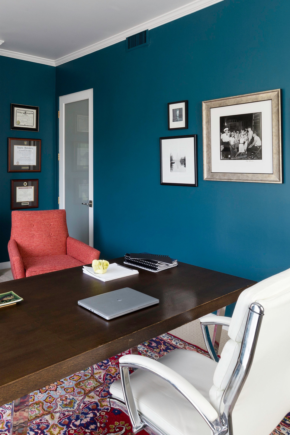
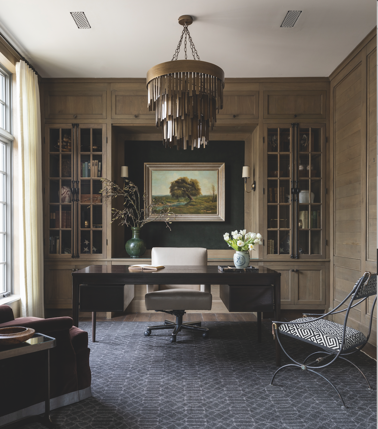
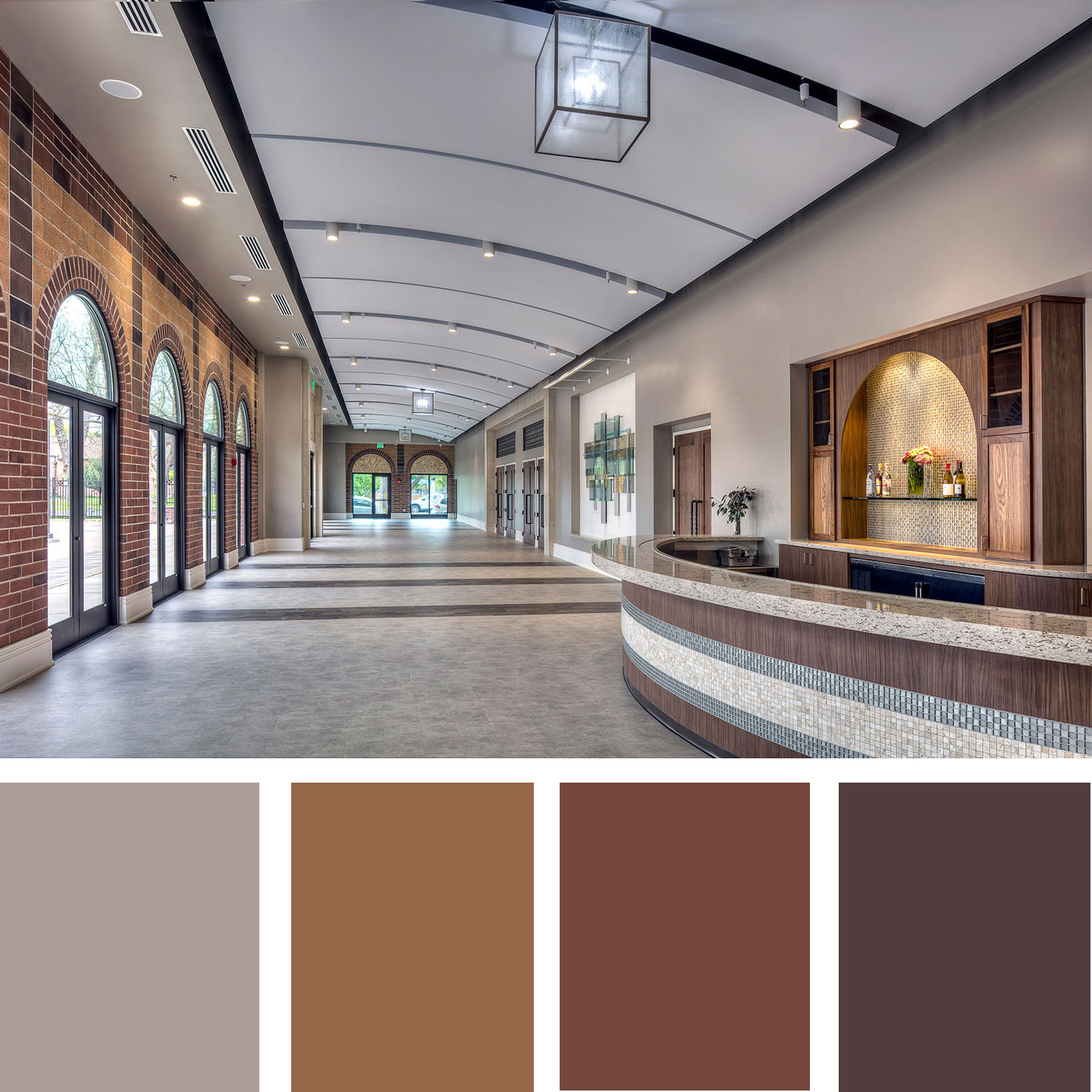
- Interior Design: Color palettes have a significant impact on the atmosphere and ambiance of interior spaces. Interior designers use carefully curated color palettes to create a specific mood or to coordinate with existing architectural elements or furnishings. The right color palette can make a space feel more cohesive, inviting, and visually pleasing.
How to use the color palette
A color palette is a powerful tool used to create visual harmony, evoke emotions, and establish a cohesive design language. Whether you are a graphic designer, artist, web designer, or interior decorator, understanding how to effectively use a color palette can greatly enhance your work.
Understanding Color Combinations:
A color palette typically consists of multiple colors that work together harmoniously. Here are some popular color combinations and their effects:
- Monochromatic: Use different shades, tints, and tones of a single color for a cohesive and harmonious look. Monochromatic color palettes create a sense of elegance, simplicity, and sophistication.
- Analogous: Combine colors that are adjacent to each other on the color wheel for a harmonious and pleasing effect. Analogous color palettes can create a cohesive and balanced composition while allowing for subtle variations.
- Complementary: Pair colors that are opposite each other on the color wheel to create a vibrant and dynamic composition. Complementary color palettes generate a strong contrast and can be used to draw attention and create visual impact.
- Triadic: Select three colors that are equidistant from each other on the color wheel. Triadic color palettes offer high contrast and create a visually balanced composition that is visually engaging.
Achieving Balance and Contrast:
Incorporating balance and contrast within a color palette can greatly enhance the visual appeal of your design. Consider the following techniques:
- Balance: Distribute color evenly throughout your design by using a mix of primary, secondary, and accent colors. Establishing balance helps create a cohesive composition and prevent any single color from overpowering the design.
- Contrast: Utilize contrasting colors to create visual interest and make certain elements stand out. Contrast can be achieved through variations in hue, value (lightness or darkness), and saturation. Strong contrasts can draw attention and create emphasis within your design.
Establishing Mood and Emotion:
Colors have the power to evoke specific emotions and set the mood in a design. Consider the psychological associations of colors and how they can create a desired emotional response. For example:
- Warm colors like red, orange, and yellow evoke feelings of energy, passion, and warmth. They can create a sense of excitement or stimulate appetite.
- Cool colors like blue, green, and purple evoke calmness, tranquility, and relaxation. These colors can create a soothing and peaceful atmosphere.
- Neutral colors like gray, beige, and white evoke a sense of balance, simplicity, and sophistication. They provide a versatile backdrop for other colors or can be used to create a minimalist and modern aesthetic.
- Bright and bold colors like magenta, lime green, or electric blue can create a sense of vibrancy and playfulness. These colors are often associated with youthful energy and can be used to evoke excitement or grab attention.
Conclusion:
A color palette is a curated selection of colors that work in harmony to create visually appealing compositions. It is crucial in various industries, including art, design, fashion, and digital media, to evoke emotions, establish a visual identity, and communicate ideas effectively. Color palettes come in various types, including monochromatic, analogous, complementary, and triadic, each offering a unique aesthetic and visual impact. Whether it’s graphic design, web design, fashion, or interior design, a well-constructed color palette enhances the overall composition and creates a memorable and cohesive experience for the viewer.