
Introduction to Cottagecore Aesthetic in Urban Settings
The cottagecore color palette, known for its quaint charm and nature-inspired themes, is now capturing urban hearts. Far from the rolling hills and babbling brooks, city dwellers are adopting this style to inject serenity into their bustling environments. The essence of cottagecore lies in its nod to simpler times through rustic textures, muted colors, and elements that mirror the great outdoors.
Embracing the cottagecore color palette in urban spaces means thoughtfully integrating soft whites, warm earth tones, and pops of pastoral colors. These hues are not just about fashion or fleeting trends — they bring a piece of tranquil countryside life into concrete jungles. The palette, rich with creams, pastels, and floral accents, helps to create cozy sanctuaries amid urban chaos.
Key Elements of the Cottagecore Color Palette
The cottagecore color palette is central to creating a sense of calm and simplicity. Here are the key elements:
- Soft Whites and Creams: These colors represent purity and calm. They remind us of homemade bread and whitewashed cottage walls.
- Pastel and Earthy Greens: A nod to vegetable gardens and springtime freshness. Green hues add tranquility to any space.
- Warm Browns and Rustic Reds: Inspired by the countryside. They evoke the rich colors of tilled soil and autumn leaves.
- Floral Hues: Soft pinks, lavender, and buttercup yellow bring in the charm of wildflowers. They offer a gentle pop of color.
In urban homes, integrating these colors can be done through various means. Think of white linen curtains, pastel kitchenware, or wooden furniture with a rustic red hue. Accessories in floral tones can brighten up a room without overwhelming it.
Adapting Cottagecore Colors to Modern Urban Interiors
Modern urban interiors often showcase a sleek, contemporary aesthetic. However, infusing cottagecore seasons color palette can soften their appearance and bring in a sense of peace. Here are practical ways to adapt these colors to modern urban living spaces:
- Highlight Neutral Bases: Start with a neutral base like off-white or soft beige. This acts as a canvas for layering cottagecore colors.
- Accent with Pastels: Use pastel accents to add a gentle touch of nature. Cushions, throws, or wall art can incorporate these hues without overwhelming the space.
- Floral Patterns for Vibrancy: Include floral patterns in moderation. Curtains, bedding, or upholstery with small floral designs can serve as vivid yet subtle highlights.
- Natural Textures: Combine the cottagecore color palette with natural textures. Linen, wool, and rustic wood can enhance the earthy feel.
These adaptations blend the allure of the countryside with urban sophistication. They create spaces that feel both modern and nostalgic. The key is to find the right balance that works for your home’s character and your personal style.

Exploring Cottagecore Subcategories for Urban Homes
Urban homes can dive deeper into the cottagecore aesthetic by exploring its subcategories. Each offers a unique blend of the cottagecore color palette, tailored to different tastes and home styles.
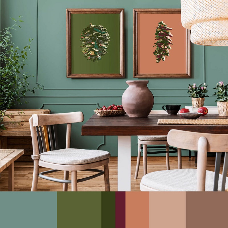
Cottagegore: Twilight Charm
Cottagegore brings a darker twist to cottagecore. Deep burgundy and moss green add mystery to urban spaces. Think stormy grays for a living room accent wall or kitchen cabinets for an eerie, yet rustic charm.
Fairycore: Whimsical Magic
Fairycore captures the enchantment of fairy tales. Soft pinks, lilac, and sky blue can transform a bedroom into a dreamy escape. Pair pastel linens with whimsical decor to create a magical urban haven.
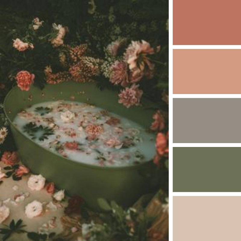
Goblincore: Earthy Richness
Embrace the depths of the forest with goblincore. Dark greens, browns, and grays mimic the natural world. Use these colors in textiles and decor to add a grounded, earthy feel to your home.
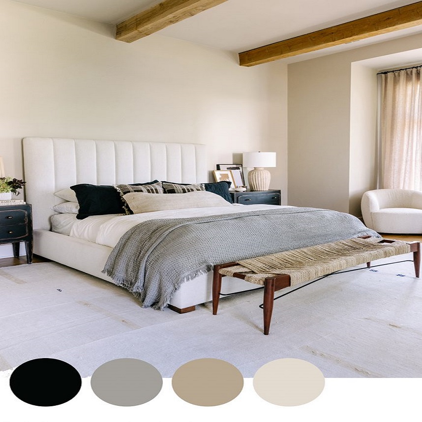
Grandparentcore: Vintage Touch
Grandparentcore is nostalgia in a palette. Muted tones like cozy beige and delicate lace white evoke memories of yesteryear. Incorporate these hues through vintage furniture or floral patterns for a comfort-rich space.
Honeycore: Sweet Warmth
Honeycore’s rich amber and golden yellows sweeten any room. Use these colors in kitchen accessories or dining linens to warm up your space like a sunbeam.
Mori Kei: Forest Style
Mori Kei brings the woodland indoors with greens, browns, and creams. Add touches of this palette with indoor plants and nature-inspired artwork.
Naturecore: Vivid Nature
Naturecore bursts with the full spectrum of nature. Integrate vivid blues and lush greens in home textiles to reflect the outdoors. Accent with vibrant oranges or muted grays for a full nature immersion.
Each subcategory allows urban homes to personalize their space. They draw from the classic cottagecore palette with a twist to suit any urban dwelling. Mix and match these subcategories to find your ideal urban cottagecore setting.
Inspiration from Influential Cottagecore Personalities
The cottagecore trend thrives not just in design but through its community and influencers. These personalities often curate and share their cottage-inspired worlds, becoming a source of inspiration. We admire their unique takes on the cottagecore color palette, and how they integrate it into their lifestyle. Whether it’s fashion, home decor, or garden design, they bring fresh ideas to the table.
Discovering Style Leaders
Style leaders in the cottagecore community showcase their love for the aesthetic. They mix creams and pastel greens in their wardrobe or adopt warm earthy tones for home interiors. Their profiles reveal how they use floral hues to add a touch of the wildflower fields to their daily lives.
Follow Cottagecore Blogs and Accounts
Many enthusiasts run blogs and Instagram accounts dedicated to the cottagecore life. They post pictures and stories showing how they blend rustic reds, gentle greens, and soft whites in their spaces. By following them, you can gather new ideas on using the cottagecore color palette.
Embracing the Lifestyle through Visual Stories
Influencers often share visual stories that highlight their cottagecore inspired choices. They help audiences imagine the possibilities, whether it’s a piece of clothing or a corner of their home. This authentic sharing helps spread the charm of the cottagecore color palette.
Engaging with Online Communities
Online communities around cottagecore are rich with discussion and exchange of ideas. Here, you can find advice on integrating the cottagecore color palette into urban settings. It’s also a space to connect with like-minded individuals who share your passion for a simpler, more naturalistic lifestyle.
Seasonal Adaptations of the Cottagecore Palette
As seasons change, so do the colors of nature, and with it, our homes can too. The cottagecore color palette adapts beautifully with the turn of each season. Here’s how you can evolve your urban home with the hues of each season.
Spring: Renewal and Freshness
Spring is all about new beginnings. Soft whites and creams take center stage, mirroring the delicate blossoms outside. Pastel greens bring the freshness of budding leaves indoors. Floral prints in decor can reflect the blooming world, giving your home a sense of new life.
Summer: Vibrancy and Warmth
Summer calls for brighter, more vibrant versions of cottagecore colors. Think sun-kissed earthy yellows and lush, vibrant greens. Floral hues become stronger, with bright pinks and lavender accents. These colors match the lively energy of summer and fill your home with warmth.
Autumn: Depth and Richness
As leaves change, so does the cottagecore palette. Warm browns and rustic reds deepen to reflect the fall scenery. The greens mellow into richer, darker shades. Incorporating these colors can make your home feel cozy and inviting, embracing autumn’s richness.
Winter: Comfort and Tranquility
Winter’s palette is all about coziness. Deeper creams and soft whites mimic snow and offer calm. Warm greens and browns provide solace from the cold. Touches of red hint at the festive season, creating a tranquil escape from the winter gusts.
Conclusion:
Bringing the soothing elements of the countryside into urban settings takes both creativity and subtlety. The cottagecore color palette—with its earthy greens, soft creams, and floral hues—offers a unique way to infuse tranquility into bustling city life. By aligning interior decor with these nature-inspired tones, urban dwellers can create a harmonious blend of rural charm and modern living.